
Agile Resource Hub
This internal site was designed to support ExxonMobil’s IT teams during their transition from waterfall to agile by centralizing learning resources, tools, and references. It served as a shared hub to help employees translate agile principles into day-to-day practice across roles and teams.
Company: ExxonMobil
Role: UX/UI Design Lead, UX/UI Design Mentor
Duration: 4 months
Tl;dr:
As the only designer on a dev-focused team, I tackled usability issues with the Agile Resource Hub while introducing design thinking to shape a more user-centered development process - resulting in a 100% NPS post-launch and establishing lasting design practices like critiques and user testing.
Problem & Pain Points
I conducted user interviews with 13 IT employees across diverse roles, regions, and experience to understand how they used the Evolve site and where it fell short. Through thematic analysis, two core problems emerged:
92% of users cited missing or outdated content,
77% struggled with cumbersome navigation that made information hard to find.
The Approach
For the site to function as a reliable hub, it needed updated content - which I coordinated with page owners - and clearer structure. I mapped the old site against user feedback to identify what to consolidate, elevate, or remove:
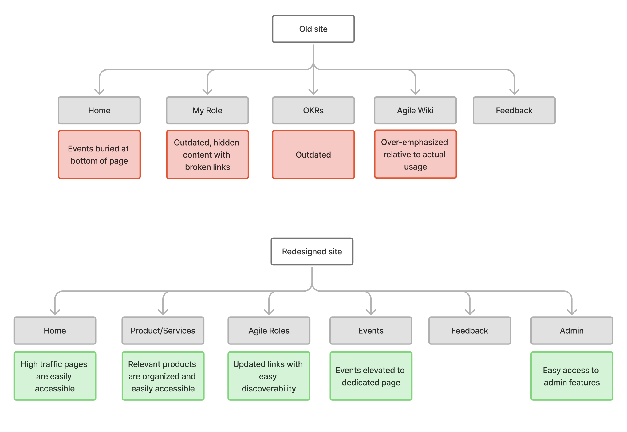
I restructured the information architecture to surface high-traffic pages, elevate events to a dedicated section, and create clear pathways for both learning and content management - addressing the needs of both learners seeking resources and admins managing content.
Final Designs
With the structure defined, the focus shifted to visual design within ExxonMobil's existing design library. Usability testing validated the new IA before committing to high-fidelity

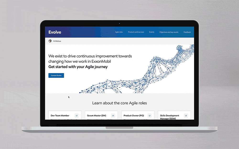
Everything competed for attention equally - the homepage was restructured around common entry points from research.

Outdated content and broken links were eroding trust - the Roles page was rebuilt around current, findable information.

Tools and references were scattered across systems - products and services were consolidated into a single page.

Events had strong demand but were buried at the bottom - accessibility was improved with a dedicated page for events.
An overview of the redesigned site's simplified navigation and content hierarchy across pages.

Visual inconsistency created a fragmented experience - a refined icon system established a unified visual language.
Impact & Takeaways
The redesigned site hit 100% NPS post-launch - users could find what they needed, and the content was actually there when they got there.
Working as the only designer on a dev team meant building the process and the product simultaneously. I pulled teammates into research sessions, set expectations about design in standups, and mentored a developer who wanted to learn the process. We held 1:1s alongside shadowing opportunities, where she acted as a collaborator rather than just an observer. She eventually moved into a UX role within the team.