
Digital Storefront
THISBOWL is a fast-casual brand from Australia known for Japanese-inspired bowls, a wellness-forward ethos, and a strong visual identity on social media. The brand appeals to customers who value quality ingredients and a refined, intentional aesthetic.
Company: THISBOWL
Role: UX/UI Designer
Duration: 2 months
Tl;dr:
While working front of house at THISBOWL's first US location, I conducted an independent UX audit of their website and proposed a redesign to align the site with the brand's polished Australian identity. The founder was receptive, though the project paused due to budget constraints.
Problem & Pain Points
THISBOWL launched in the US with a website that didn't reflect the polish of its Australian site or its strong social media presence. Being on the ground, I understood the brand's standard and saw an opportunity to bring that same clarity to the digital experience.
Where the site fell short
On Instagram: the intentionality behind the US launch
That clarity started with understanding what users actually needed. Newcomers wanted context about what THISBOWL serves, health-conscious customers asked about dietary options, and regulars just wanted fast menu access. Across all groups, the expectation was the same: clarity and polish.
The Approach
I audited the site against competitors the founder admired - efficiency-focused brands like Sweetgreen and CAVA, and aesthetic-driven brands like Aimé Leon Dore that use visuals to invite exploration. THISBOWL sat in between: a fast-casual restaurant with the identity of a lifestyle brand. The question became whether to lead with information or intrigue.
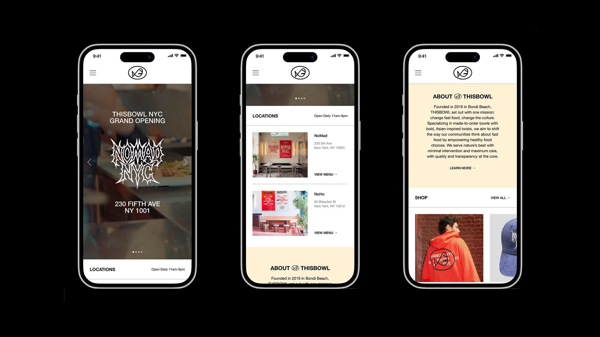
I developed two directions reflecting that tension, focusing on mobile as the most common entry point for on-the-go customers and curious newcomers. The robust homepage offered menu, locations, and brand context in a single scroll; the minimal option leaned into imagery and discovery.
Final Designs
I recommended the robust homepage - it reduced friction for newcomers needing context and returning customers wanting the menu. One scroll to access everything felt more aligned with fast-casual expectations than multiple taps to explore.
Impact & Takeaways
I presented the work to the founder, who brought in the Head of Marketing to explore next steps. The project paused due to budget, but it showed what's possible when design insights come from firsthand experience rather than assumptions.